Before Renault, in 2022, before Peugeot, in 2021, Citroën changed its logo in depth. We take a look back at a legendary emblem, the double chevron. Here is its evolution through the ages.
Almost a year apart, Peugeot (in February 2021) and then Renault (in January 2022) adopted a new logo. In the trio of French brands, Citroën was a pioneer in 2017 by inaugurating at the time a simplified emblem called “flat design”. Let’s retrace the evolution of the double chevron and, as the advert from the 1980s said: “Citroën ahead! ”
TO READ. Relive Citroën’s centenary at La Ferté Vidame!
1919-1959: from oval to octagon

Yellow chevrons in a yellow oval on a blue background characterize the very first logo. Until 1959, the famous double chevron underwent subtle changes such as the disappearance of the A (for André) in front of the Citroën name, then the transformation of the oval into an octagon. In order not to look like Ford’s blue oval, from which André Citroën was inspired for the Taylorization of work?

1959-1966: arrowheads and gold chevrons
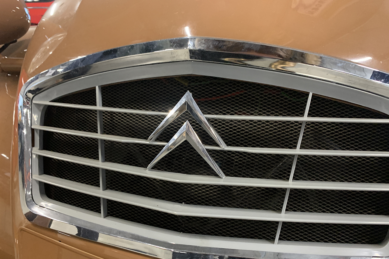
At the dawn of the 1960s, a change of direction: the rafters take on volume. In any case, they are stylized in that sense. They display a yellow color in agencies and even gold for concessions. The golden age of the brand? For a perfect highlight, a white oval positioned horizontally and no longer vertically comes in the background. Graphically, this gives the brand strength.
1966-1984: complex but without complex

In 1966, the Citroën logo became more bourgeois and more complex. The white oval or rather the ellipse is inscribed in a blue square, itself framed by a yellow border. A device that highlights the Citroën name. It is this logo which adorned the legendary Citroën DS restyled, those equipped with headlights rotating under globes.
1985-2008: red and revolutionary
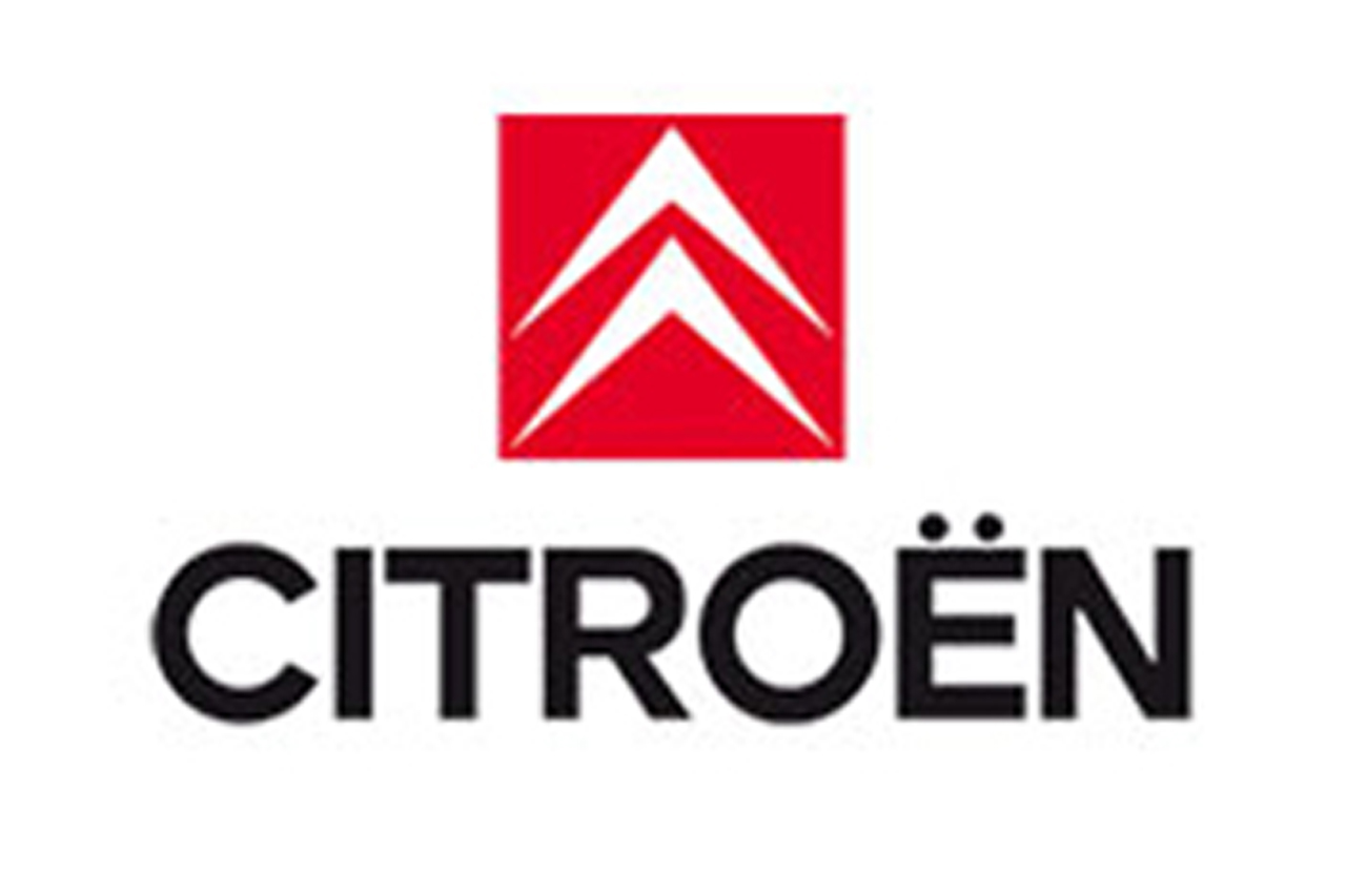
In 1985, the double white chevron asserted itself on a red square, all soberly underlined by black Citroën lettering whose bold typography brings modernity. This new strong and effective visual identity is supported by the commercial The Wild Chevrons. The 1980s also embody a prosperous period for Citroën with big-show advertising films such as the one illustrating a Visa GTI catapulted from an aircraft carrier and then resurfacing on the hull of a submarine. A work by Jacques Séguéla.
2009-2016: 3D and technicality

In February 2009, the Citroën brand wrote its name in red letters under rounded silver chevrons with a three-dimensional effect (see opposite). An evolution of the logo that accompanies the launch of models significantly rejuvenating the image of the brand, but also its customers. Very neat, the typography of the Citroën lettering alone embodies a certain modernity. The perfect example conveying this identity is the Citroën Technospace concept car, which will give birth to the second generation of the C4 Picasso.
Since 2017: “ I make you my essential “
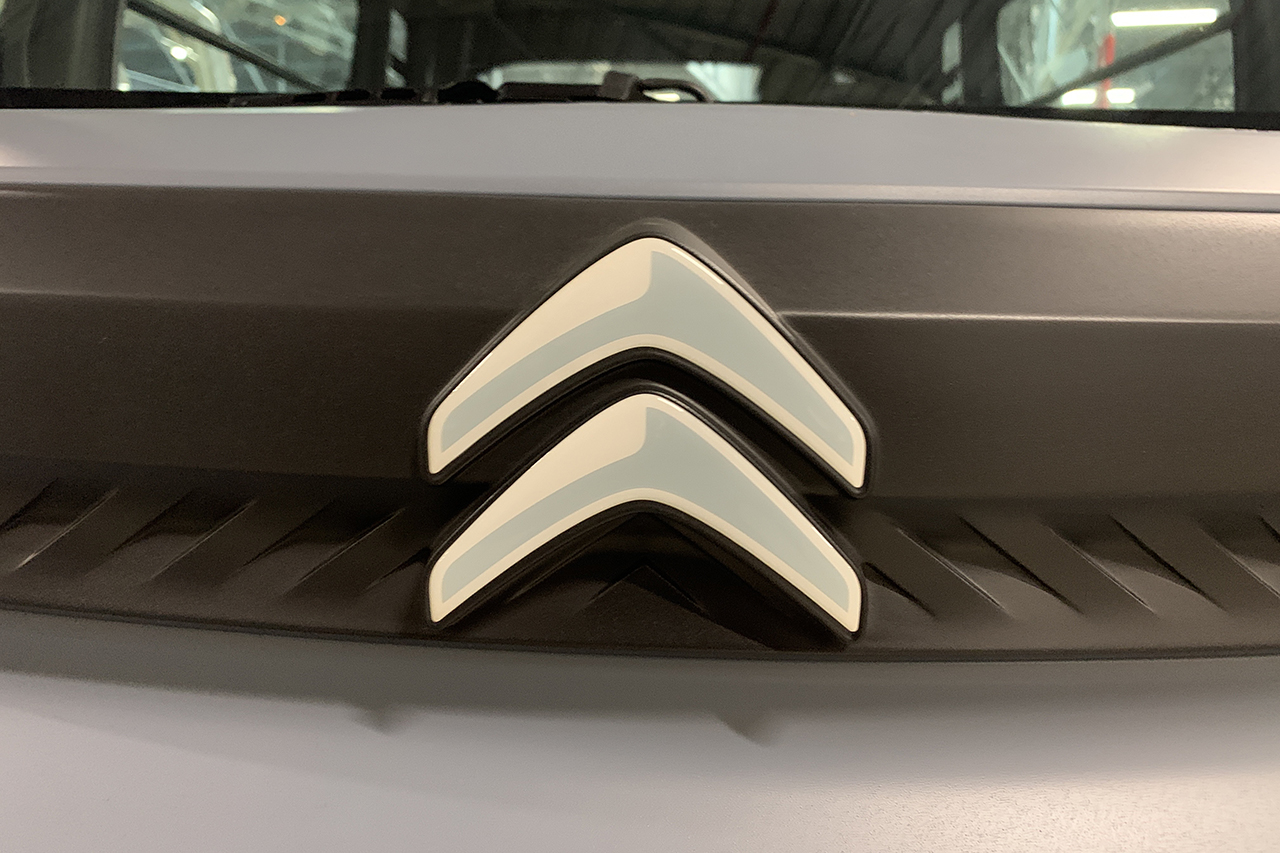
After the repositioning of the brand in the PSA group and even more today with the creation of the giant Stellantis, the logo is ultra-simplified. No more 3D. Square, Conversely, flat design and monochrome. Without being as die-hard as Dacia, the brand low cost of the Renault group, Citroën is now the so-called essential brand at the bottom of the scale. A typical example of this new strategy is the Citroën AMI electric quadricycle.
TO READ. Citroën Ami (2021). First reliability assessment after a year of career
